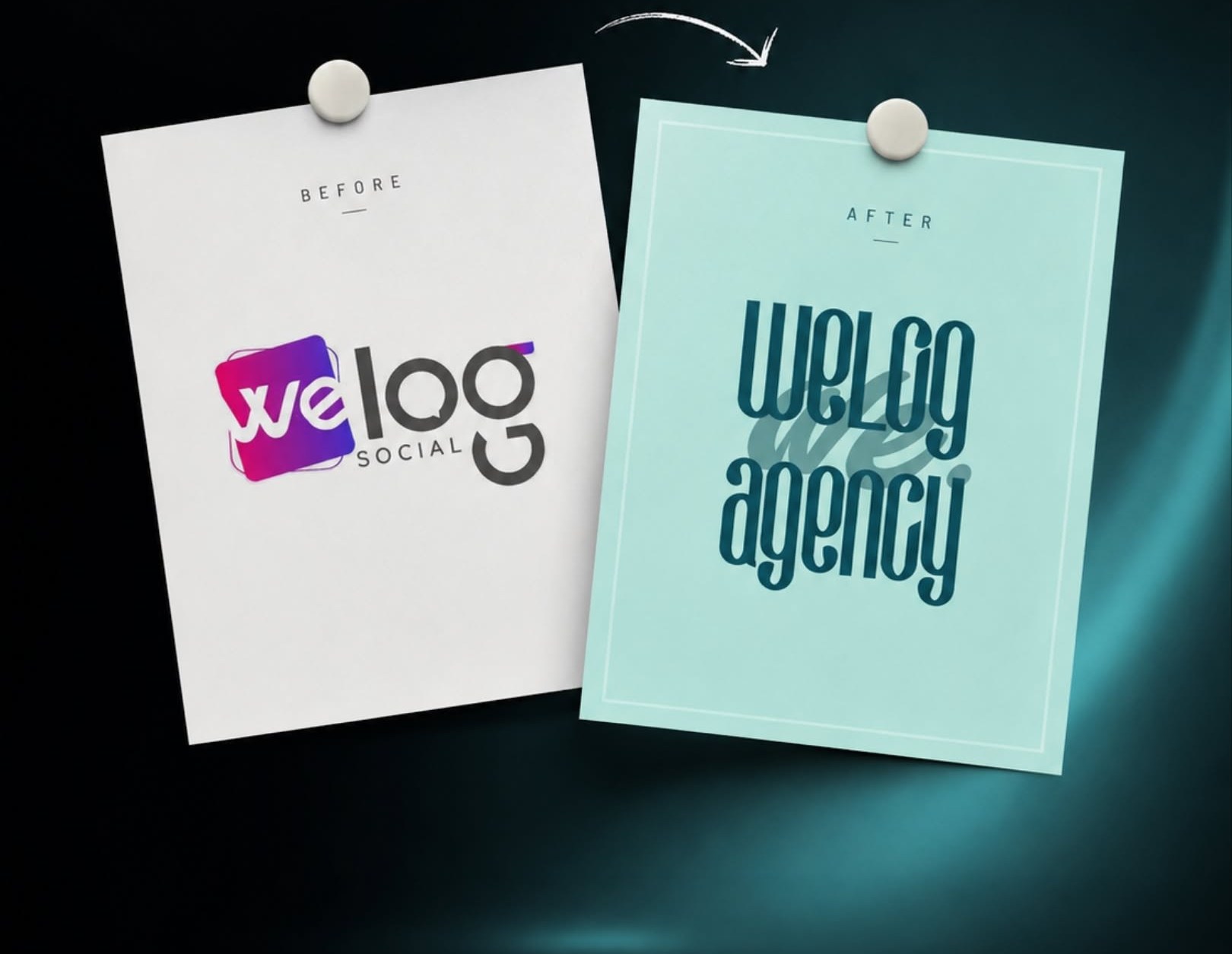
Same energy, a stronger identity. For Welog, one of Türkiye’s leading influencer marketing agencies, 1311 CO. carried out a complete rebranding: repositioning the brand, refreshing its image and redesigning every touchpoint under one consistent brand world.
Renewing a brand is not just about changing its logo; it is about rethinking how it looks, how it speaks and how it is remembered. Welog had a dynamic, creative character, but its previous identity no longer reflected the agency it had grown into.
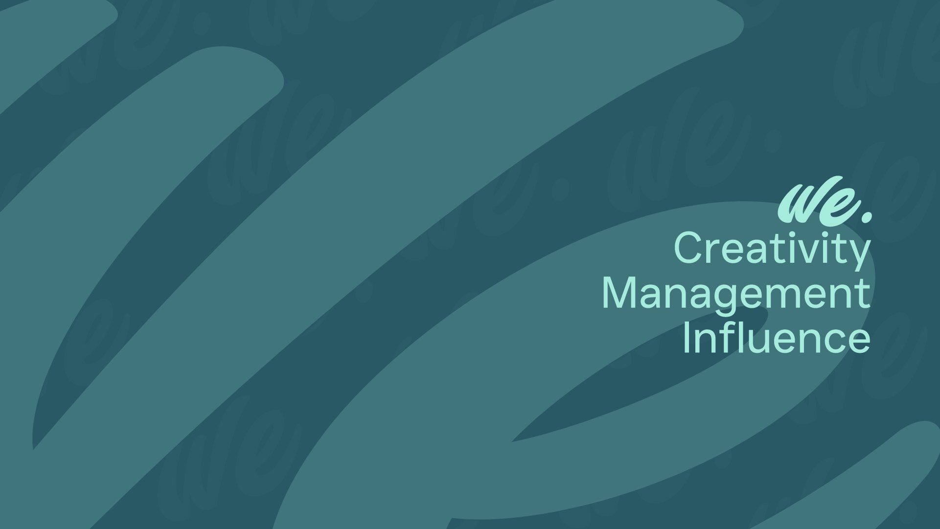
We carried that energy into a simpler, more contemporary and more confident visual system, shifting the perception of the brand towards a creative influencer marketing agency built on creativity, management and influence.
One System, Every Touchpoint
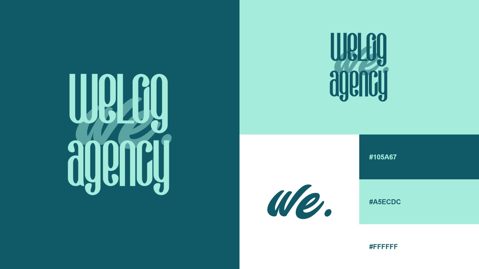
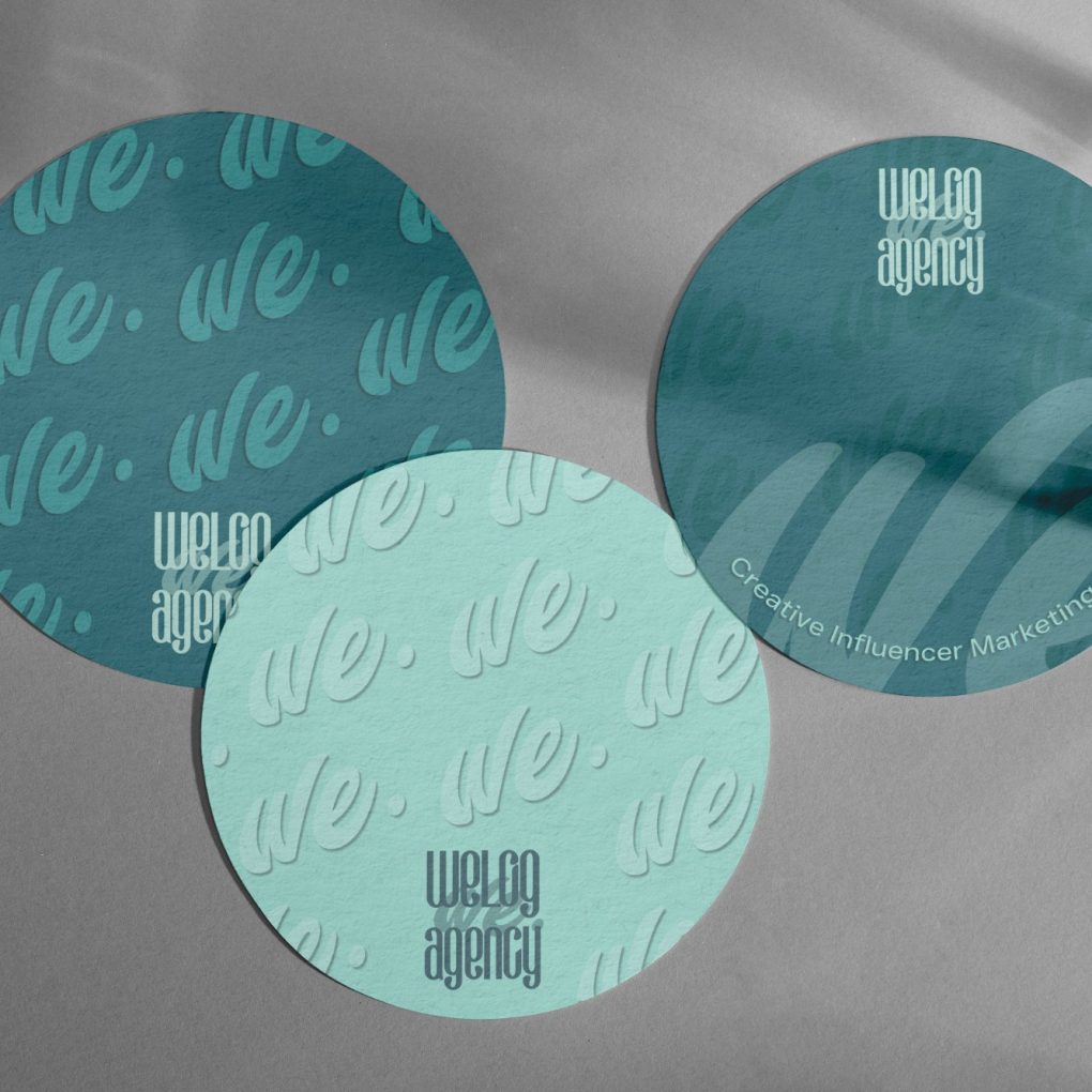
From the new logo structure and the we. monogram to the teal and mint colour palette, we defined light and dark uses so the identity works on every surface.
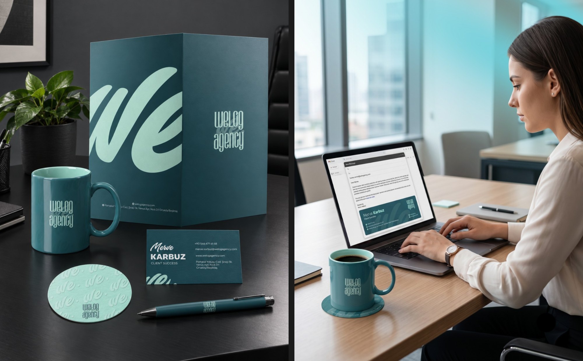
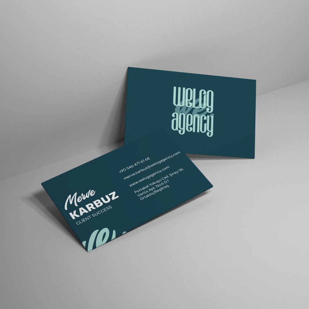
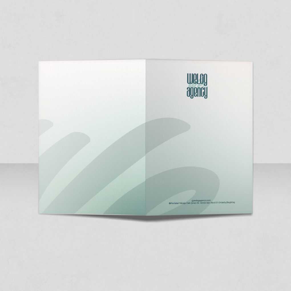
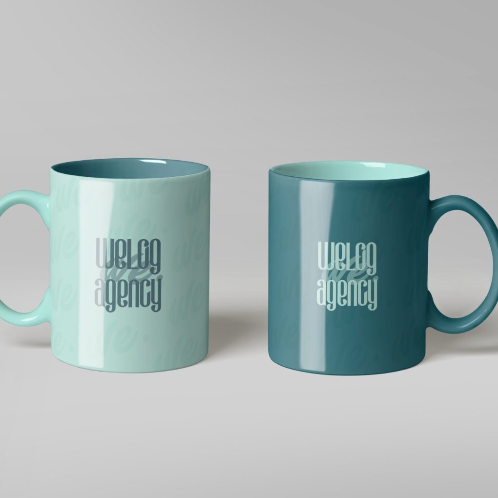
We then applied it across all corporate materials – business cards, presentation folders, email signatures, branded mugs and coasters, the company presentation and seasonal greeting cards – so Welog looks and feels the same wherever people meet it.
A Social Voice That Feels Like Welog
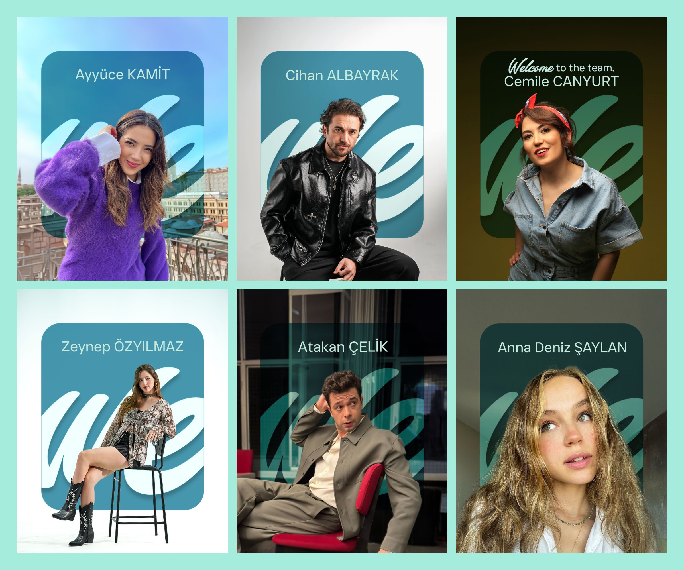
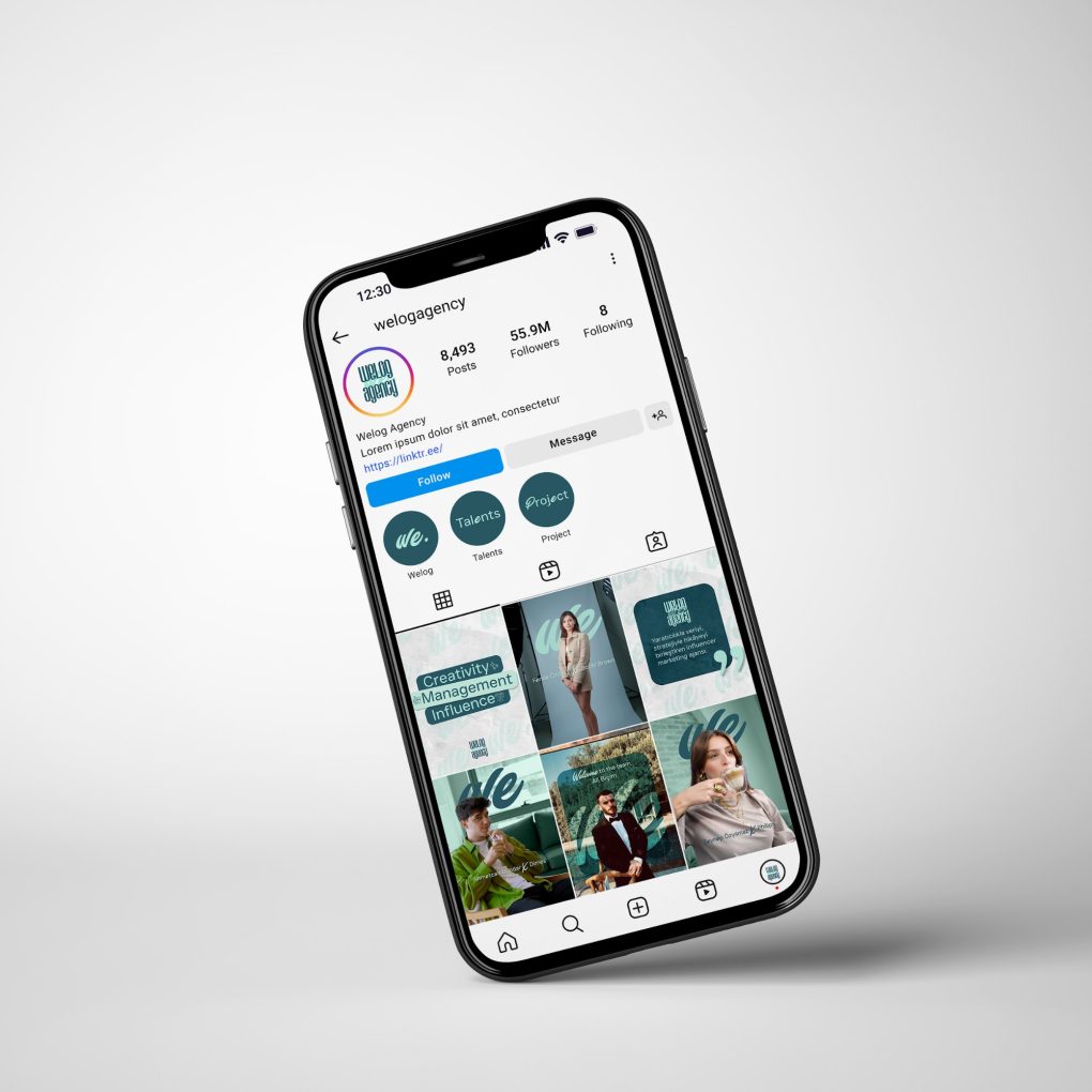
The new identity continued on social media. We designed Instagram and LinkedIn templates, launch and welcome-to-the-team posts, collaboration announcements, story highlights and web banners that all speak the same visual language.
The result: a more original, more flexible WELOG, closer to how brands and creators communicate today.
Rebranding by 1311 CO. Everything starts with a good CO.
Cookie Consent
We use cookies to understand how our site is used and to improve your experience. You can accept all, reject non-essential cookies, or manage your preferences.